Flight Paths · Southern Hemisphere
Flat Earth Flight Paths: Why Plane Routes Make More Sense on the True Map
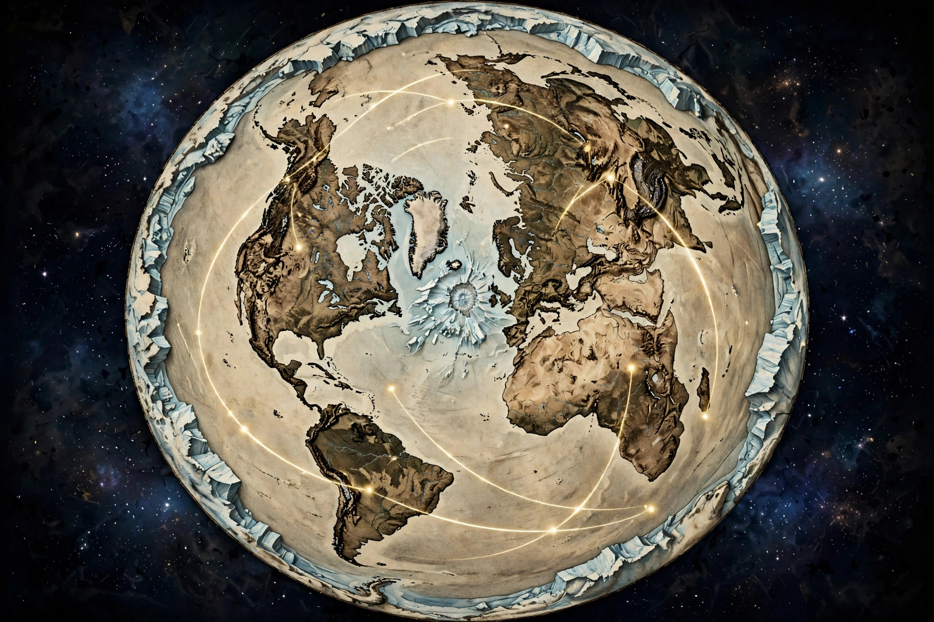
Every day, thousands of commercial flights cross the skies — and every day, their routes quietly contradict the globe. Ask a simple question: why do so many flight paths look strange, indirect, or outright absurd when drawn on a globe map? The official answer is always some variation of "great circle routes" and "map projection distortion." But there is a far simpler explanation, and it has been sitting in plain sight for over a century: planes fly straight lines on a flat earth, and the "curves" only appear when you force those straight flights onto a ball.
This is the argument from flat earth plane routes, and it is one of the most practical, testable lines of evidence in the entire movement. You don't need a telescope, a laser, or a high-altitude balloon. You need a flight tracker, a map, and an honest look at what pilots actually do.
What Are Flat Earth Flight Paths?
Flat earth flight paths are commercial airline routes plotted on the azimuthal equidistant flat earth map instead of a globe projection. When drawn on the true map, routes that look curved or detouring on globe maps become straight, direct lines — matching the actual shortest-path flights pilots fly every day.
The core claim is straightforward. Aircraft fly the shortest practical distance between two airports — a straight line, adjusted for winds, weather, and restricted airspace. On the flat earth map, the azimuthal equidistant projection centered on the North Pole, those straight lines look like straight lines. On globe-based map projections, the identical flights appear as dramatic arcs that swing hundreds or thousands of miles out of their way.
Globe defenders have a ready-made excuse for this: all flat maps distort a sphere, so of course the routes look odd. But notice what this excuse concedes. It admits that the map you're looking at doesn't represent reality. The question is which distortion is telling the truth — and the flat earth answer is that the "distortion" disappears entirely when you stop pretending the ground is a ball. Pilots don't fly curves to follow an invisible sphere. They fly straight, because the earth is flat.
This isn't abstract theory. Open any flight tracker and watch a southern hemisphere flight in real time. Then plot that same flight on both maps. The difference is not subtle, and once you see it, you can't unsee it.
Globe Projections vs. the True Map
Globe projections distort flight paths because every flat rendering of a sphere stretches some regions and compresses others. The azimuthal equidistant map — the same layout on the UN flag — shows flight routes as the straight lines pilots actually fly, with distances from the center preserved.
Here's the part globe believers rarely think through. Every map you've ever seen of "the globe" is a flat piece of paper or a flat screen pretending to be a ball. The Mercator projection stretches the poles into infinity. Other projections slice, squash, and warp. Cartographers openly admit that no flat map of a sphere can preserve distances, directions, and shapes all at once.
So when a flight path looks like a giant arc on your screen, you're looking at an artifact of the projection — not the flight. The aircraft is flying essentially straight. The map is lying.
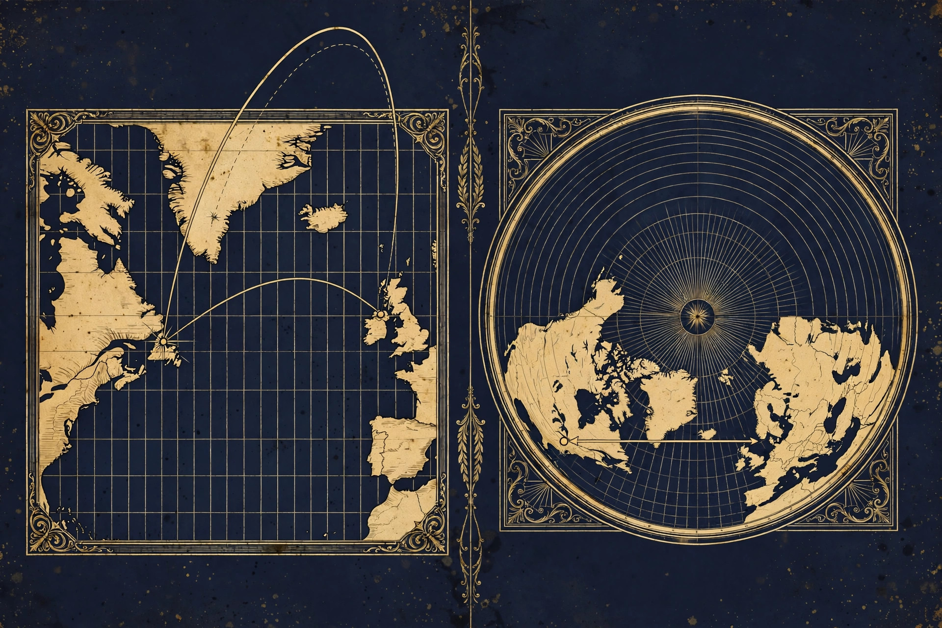
Now flip it around. Take the azimuthal equidistant projection — the circular map with the North Pole at the center and the continents radiating outward, the exact layout featured on the UN flag. Plot the same flights on this map and the arcs vanish. Routes become direct. Flight times line up with distances. Emergency diversion airports sit on the route instead of hundreds of miles off it.
Which map would you trust: the one where reality looks wrong, or the one where reality looks right? The Flights section of this site digs deeper into the route data, but the visual test alone is devastating.
Sydney–Santiago: The Route That Breaks the Globe
The Sydney to Santiago flight takes about 12.5 hours and arcs deep into the southern latitudes. On a globe map the path looks like a strange detour; on the flat earth map it is a near-straight line across the southern plane — and the flight time matches that straight-line distance, not the globe's.
If there is one route every researcher should study first, it's Sydney, Australia to Santiago, Chile. This is one of the longest southern hemisphere commercial flights in the world, and it behaves nothing like the globe model predicts.
On a standard globe map, the "shortest" path between Sydney and Santiago is supposed to swing far south, deep toward Antarctica. Passengers on this route report something curious: the flight spends hour after hour over open ocean in the far south, with flight paths that look — on the globe — like enormous detours. Yet the flight consistently lands in around twelve and a half hours.
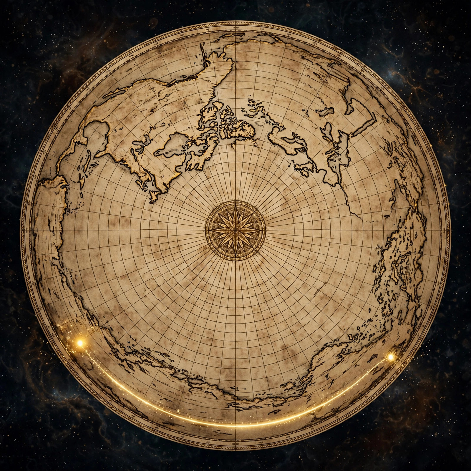
Now draw that same route on the flat earth map. Sydney sits on the right side of the disc, Santiago on the left, and the line between them runs straight across the southern regions — no bizarre polar swing, no thousand-mile detour. The flight time fits this straight-line distance far more comfortably than it fits the globe's contorted geometry.
Globe defenders will insist the deep-southern arc is the shortest path on a sphere — a "great circle." But step back and think about what they're claiming: that the shortest, most fuel-efficient path between two cities requires swinging thousands of miles toward the coldest, most remote ocean on the planet. On the flat map, no such swing is needed. The plane flies straight. The simplest explanation is usually the right one.
Johannesburg–Perth and Auckland–Buenos Aires
Sydney–Santiago isn't an outlier. The entire southern hemisphere is full of routes that embarrass the globe model.
Take Johannesburg to Perth — South Africa to Western Australia, roughly nine hours in the air. On the globe, this route is drawn arcing far south over the Indian Ocean, in some renderings dipping toward Antarctic latitudes. On the flat earth map, it's a clean, direct line across the southern plane. Again, the flight time matches the straight line.
Then there's Auckland to Buenos Aires — New Zealand to Argentina, nearly twelve hours. Same story: the globe's "great circle" sends it on a sweeping southern arc, while the flat map shows a straightforward crossing. Every one of these routes follows the same pattern: absurd on the ball, sensible on the plane.
Notice the pattern's direction. Northern hemisphere routes — New York to London, Tokyo to Los Angeles — look perfectly normal on both maps, because the northern hemisphere is compact around the North Pole in the azimuthal layout. The anomalies cluster in the south, exactly where the globe model stretches distances the most and where the flat earth model says the world is widest. That's not a coincidence. It's a signature.
The southern hemisphere is where the globe model goes to die, and flight paths are the murder weapon. As we explore in our companion piece on flight routes on the flat earth map, the route-by-route comparison leaves the ball model with nowhere to hide.
Emergency Landings in "Impossible" Places
Emergency landings often happen at airports that look wildly off-route on a globe map. On the flat earth map, those diversion airports sit directly along the flight's true straight-line path — which is exactly why the pilots chose them in an emergency.
Here's the test pilots themselves keep accidentally running. When a medical emergency or mechanical issue forces a plane down mid-flight, the crew diverts to the nearest suitable airport along their actual path. Time is critical; nobody diverts hundreds of miles sideways for fun.
Time and again, these emergency landings happen at airports that make no sense on the globe. A flight supposedly arcing over the northern Pacific puts down somewhere that looks, on the globe map, like a massive detour. But plot the diversion on the flat earth map and the "detour" vanishes — the airport is sitting right on the straight line the plane was actually flying.
Think about what that means. In an emergency, with lives on the line, pilots divert to airports that are on their true route. If the globe map were accurate, those diversions would be absurd wastes of precious minutes. The pilots' actions reveal the real geometry: they fly the flat map, whether they know it or not.
Skeptics wave this away as coincidence or cherry-picking. But coincidences don't repeat across dozens of incidents on multiple continents over many years. A pattern that consistent isn't luck — it's the map.
Flight Times vs. Globe Distances
Let's talk numbers, because numbers don't care about your cosmology. Commercial aircraft cruise at roughly similar speeds — around 550 mph ground speed for a typical jetliner, adjusted for wind. That means flight time is a rough proxy for distance. If the globe's distances are right, flight times should match them. When they don't, something is wrong with the map.
| Route | Typical flight time | On the globe map | On the flat earth map |
|---|---|---|---|
| Sydney → Santiago | ~12.5 hrs | Deep southern arc | Direct southern crossing |
| Johannesburg → Perth | ~9 hrs | Southern ocean arc | Direct line |
| Auckland → Buenos Aires | ~11.75 hrs | Sweeping southern arc | Direct line |
| Santiago → Sydney (return) | ~14 hrs | Polar-swing arc | Direct (headwinds add time) |
| Dubai → Los Angeles | ~16 hrs | Over the North Pole | Northern straight line |
The return leg is worth pausing on. Santiago to Sydney takes about ninety minutes longer than the outbound trip — globe defenders credit headwinds, and winds do matter. But the asymmetry is consistent with the flat map's geometry too, where the eastbound and westbound paths cross different wind systems circling the plane. Either way, the times fit straight-line distances on the flat map without requiring thousand-mile detours.
And Dubai to Los Angeles? On the globe, this flight supposedly goes over the North Pole. Passengers expecting a polar adventure instead get a routine long-haul. On the flat earth map, the route is a straightforward northern line — no pole required. The plane flies straight; only the globe model needs the theatrics.
You can verify every one of these times yourself on any flight tracker. The data is public. The maps are public. The only thing standing between you and the conclusion is the assumption you were taught in school. Test it — that's what this movement is about.
Watch: Routes Drawing Across the True Map
Sometimes a few seconds of motion says more than a thousand words. Watch flight routes draw themselves across the true map — straight, direct, and exactly where the planes actually go:
Flight routes animating across the azimuthal equidistant flat earth map.
Get the Map and Check the Routes Yourself
🗺 GET THE TRUE MAP
Don't take our word for it — plot the routes yourself. These historic flat earth maps let you trace every flight path in this article with a ruler and see the truth firsthand.
As an Amazon Associate we earn from qualifying purchases. See also our Amazon Finds page for more research gear.
The single most powerful thing you can do with this information is also the simplest: get a real flat earth map and start plotting. Gleason's New Standard Map of the World from 1892 is the gold standard — a detailed, beautiful azimuthal equidistant map you can hang on your wall and use as a working research tool. The Urbano Monte world map from 1587 shows that this layout isn't some modern invention; cartographers were drawing the world this way centuries before the globe model was enforced in classrooms.
Grab a ruler, pick any southern hemisphere route from a flight tracker, and draw the line. Then compare it to the flight time. You'll see what we see — and you'll never look at a globe the same way again. Every map in our maps collection is chosen for research accuracy, and our store carries gear for the newly awakened.
Frequently Asked Questions
Why do flight paths look curved on a globe map?
Flight paths look curved on globe-based projections because the map itself is distorted — every flat rendering of a sphere stretches and warps some regions. On the azimuthal equidistant flat earth map, those same routes are straight, direct lines, which is exactly how aircraft actually fly: the shortest path between two points.
What is the Sydney to Santiago flight path mystery?
Sydney–Santiago flights take about 12.5 hours and arc deep into southern latitudes. On a globe map the route looks like an indirect detour, but on the flat earth map it is a near-straight line across the southern plane — and the flight time matches that straight-line distance far better than the globe's geometry.
Why do planes make emergency landings in strange places?
Emergency diversions happen at airports that look wildly off-route on a globe map. On the flat earth map, those airports sit directly along the flight's true straight-line path — which is exactly why pilots chose them when minutes mattered. The pilots' actions reveal the real geometry.
Do pilots fly great circle routes?
Pilots fly the shortest practical route between two points, adjusted for wind and airspace. What globe defenders call a "great circle route" is simply the straight line on the flat earth map — the dramatic curve is an artifact of projecting a flat flight onto a ball.
Which southern hemisphere routes prove the flat earth map?
The strongest examples are Sydney–Santiago (~12.5 hrs), Johannesburg–Perth (~9 hrs), and Auckland–Buenos Aires (~11.75 hrs). On the globe each requires a sweeping southern arc; on the flat earth map each is a direct line whose distance matches the flight time.
Where can I get a flat earth flight path map?
Study the true layout on Gleason's New Standard Map of the World (1892) or the Urbano Monte World Map (1587), both available through our maps collection. Hang one on your wall, plot the routes yourself, and watch the globe model fall apart.
The Sky Doesn't Lie — But Maps Can
Flight paths are the globe model's quiet crisis. Every southern hemisphere route, every "impossible" emergency landing, every flight time that fits a straight line better than an arc — they all point the same direction. The planes aren't confused. The pilots aren't lost. They're flying straight lines on a flat plane, and the only thing curved is the story we've been told.
So here's your homework: pick a route, any route. Plot it on both maps. Time it. Then ask yourself which map the pilots are using — and why the textbooks never showed you the other one. When you're ready to go deeper, explore our proofs library, browse the blog for more route analyses, and bring your questions to the FAQ.
Question everything — starting with the map on the wall.
JOIN THE DISCUSSION